Responsive Website Redesign
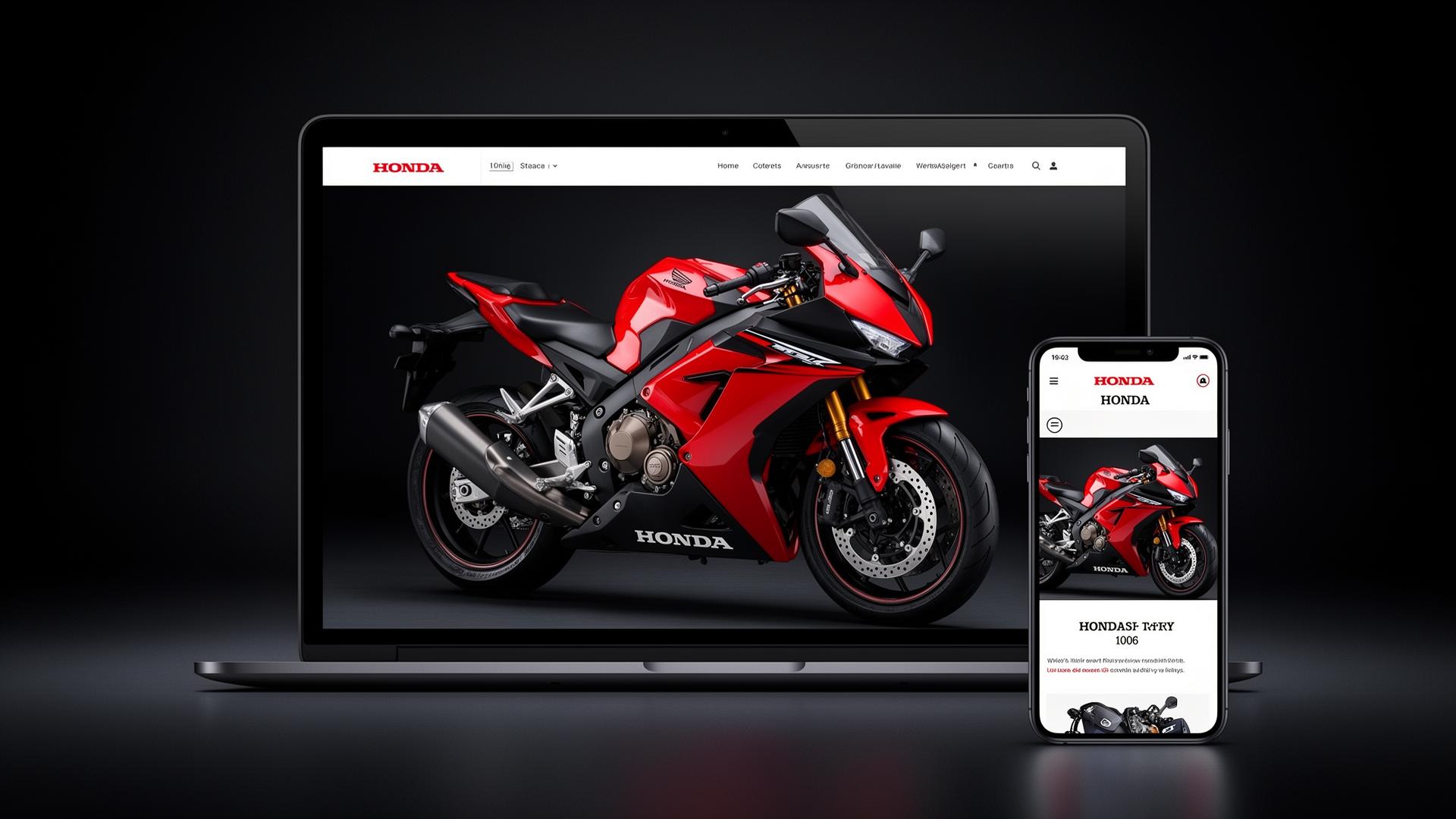
End-to-end UX transformation of Honda's Powersports consumer shopping experience—from competitive analysis and heuristic evaluation through information architecture, prototyping, and usability testing.
10
Major Deliverables
5
Project Phases
2
Responsive Prototypes
4
User Research Rounds
- Optimize Powersports consumer shopping and brand experience
- Reduce ongoing development, content update and maintenance costs
- Improve lead integration and overall website performance
- Develop a fully responsive and mobile friendly design that meets best practices
- Improve experience of first-time Powersports shoppers and Enthusiasts
- Increase conversions for main KPI driver
- Improve the site structure to allow scaling
As Lead User Experience Designer, I directed the end-to-end redesign of Honda's Powersports consumer website. This included competitive analysis, heuristic evaluation, information architecture, responsive prototyping in Axure, and usability testing validation.
From Discovery to Validation
Competitive Analysis
Protocol & notes documenting comprehensive competitive landscape research across powersports and automotive industry leaders.
- Analyzed 6+ major competitors
- Documented responsive design patterns
- Evaluated product configurators
- Assessed dealer integration approaches
Heuristic Evaluation
Detailed notations from comprehensive site audit identifying usability issues and opportunities for improvement.
- Non-responsive legacy design issues
- Complex navigation structure
- Inconsistent product comparison
- Poor dealer locator experience
Whiteboard Brainstorming
Collaborative whiteboarding sessions to explore concepts, navigation patterns, and component hierarchies.
- Cross-functional ideation sessions
- Layout exploration
- Navigation pattern concepts
- Feature prioritization
Process Flows
User journey and task flow documentation mapping critical conversion paths from product discovery through dealer contact.
- Product discovery flows
- Vehicle comparison journeys
- Dealer connection paths
- Lead generation funnels
Sitemap
Complete information architecture restructuring the site for better scalability across Honda's diverse powersports product lines.
- Street motorcycles section
- Off-road / Dirt category
- ATV product lines
- Side-by-Side (SxS) vehicles
First Iteration Hand Sketches
Rapid concept exploration through hand sketches examining layout options, navigation patterns, and component hierarchies.
- Homepage concepts
- Product detail layouts
- Comparison tool wireframes
- Mobile navigation patterns
Desktop Prototype
Full-fidelity desktop responsive prototype in Axure optimized for product showcase, comparison tools, and immersive brand storytelling.
- 1920px, 1440px, 1024px breakpoints
- Interactive product galleries
- Comparison tool functionality
- Dealer locator integration
Mobile Prototype
Mobile-first responsive prototype with touch-optimized interfaces prioritizing quick product access and streamlined dealer contact flows.
- 375px, 414px, 768px breakpoints
- Touch-friendly interactions
- Streamlined navigation
- Quick dealer contact
Prototype Annotations
Comprehensive specifications documenting interaction patterns, component behaviors, and responsive breakpoint rules for development handoff.
- Interaction specifications
- Component documentation
- Breakpoint behaviors
- Animation guidelines
Usability Testing Findings
UT findings and results from validation sessions with first-time powersports shoppers and enthusiast audiences.
- Improved navigation validated
- Mobile experience praised
- Dealer connection success
- Task completion improvements
Navigating tradeoffs between stakeholder priorities, user needs, and engineering constraints.
Mobile-First vs. Desktop Parity
Tradeoff: Honda's internal teams preferred desktop layouts, but analytics showed 60%+ mobile traffic.
Outcome: Presented data to stakeholders—secured buy-in for a mobile-first approach that still delivered a rich desktop experience.
Content Consolidation
Tradeoff: Marketing wanted product-specific microsites; UX research showed users needed unified navigation.
Outcome: Designed scalable IA supporting all vehicle lines under one roof—reducing content duplication and maintenance costs.
Prototype Fidelity
Tradeoff: Development team requested detailed specs early, but design exploration required iteration flexibility.
Outcome: Negotiated a phased handoff: low-fi concepts for alignment, then high-fi Axure prototypes with full annotations.
Dealer Integration
Tradeoff: Corporate wanted a controlled brand experience; dealers needed customization for local markets.
Outcome: Designed modular dealer pages with brand-compliant templates that allowed regional content flexibility.
Interested in this kind of work?
Let's talk about how end-to-end UX research and responsive design can transform your customer experience.